White House News Analysis
Data analysis of White House news using web scraping and data visualizations.
Overview
The White House News Analysis project is the first time I designed and executed the exploratory data science workflow end-to-end from data collection to data visualizations.
My goal with the project was to curate a data set of news items released on the White House website. Then, I wanted to visualize the data in meaningful ways to explore trends hidden within.
I started this project during the first presidency of Donald Trump. I later added code to extend the project so it also works with the White House website of the Joe Biden administration. The (very) simplified version of the code published on GitHub is meant to be a companion to my YouTube tutorials, and only contains code to scrape and visualize data from the first term of President Trump.
I made the majority of this project during high school when I first started learning about data science. While I have created more sophisticated and impressive data projects since, this project remains special to me as it represents one of the first times I realized the power of web scraping in retrieving large amounts of data from the internet and the capabilities of data analysis in surfacing and showcasing invisible insights from large sets of data.
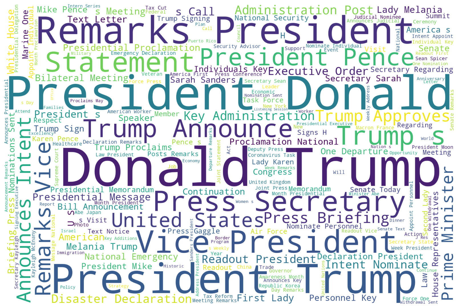
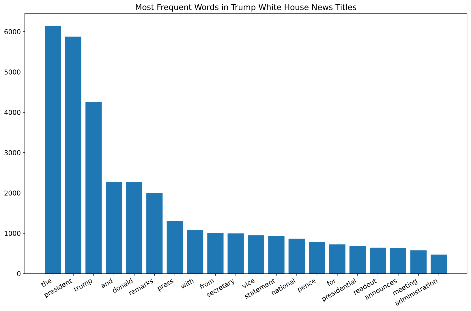
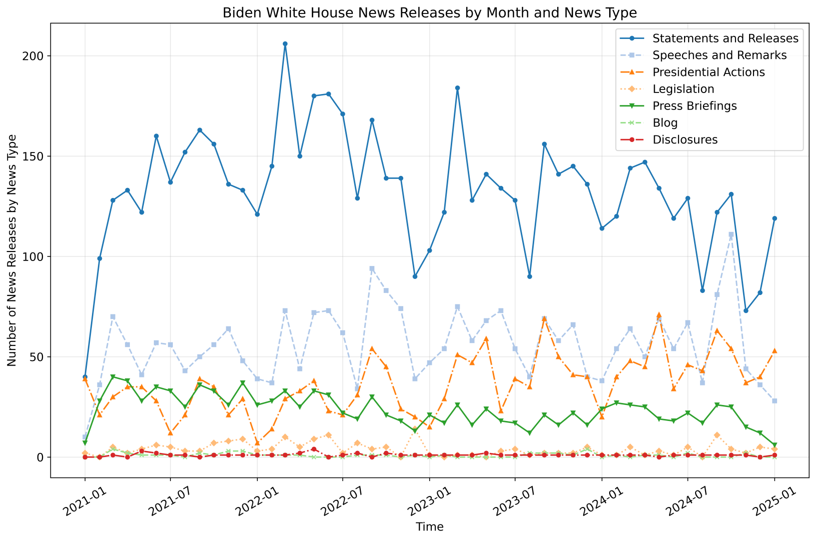
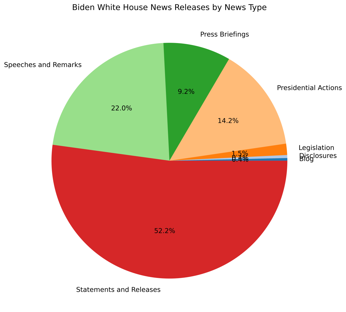
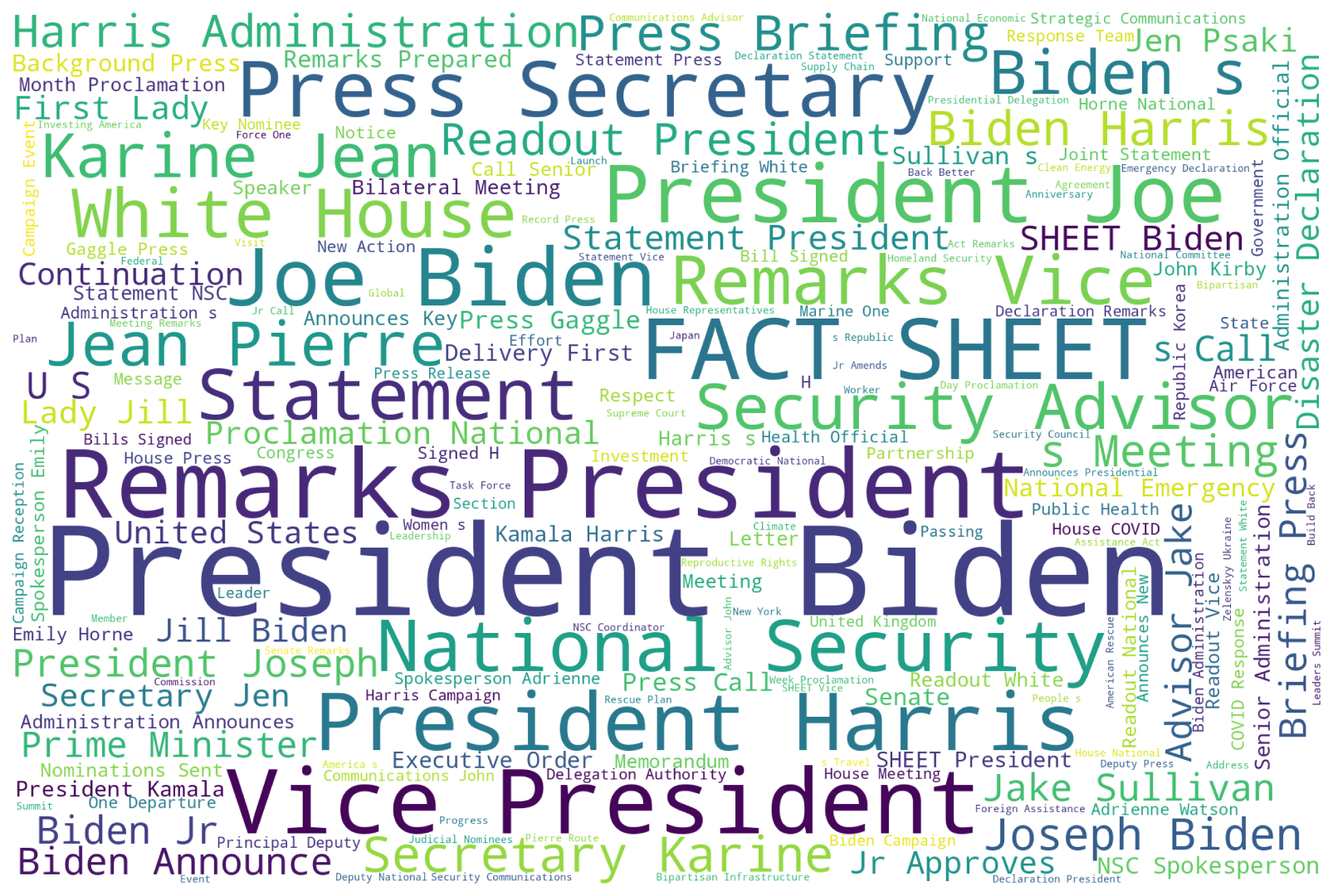
Data Visualizations
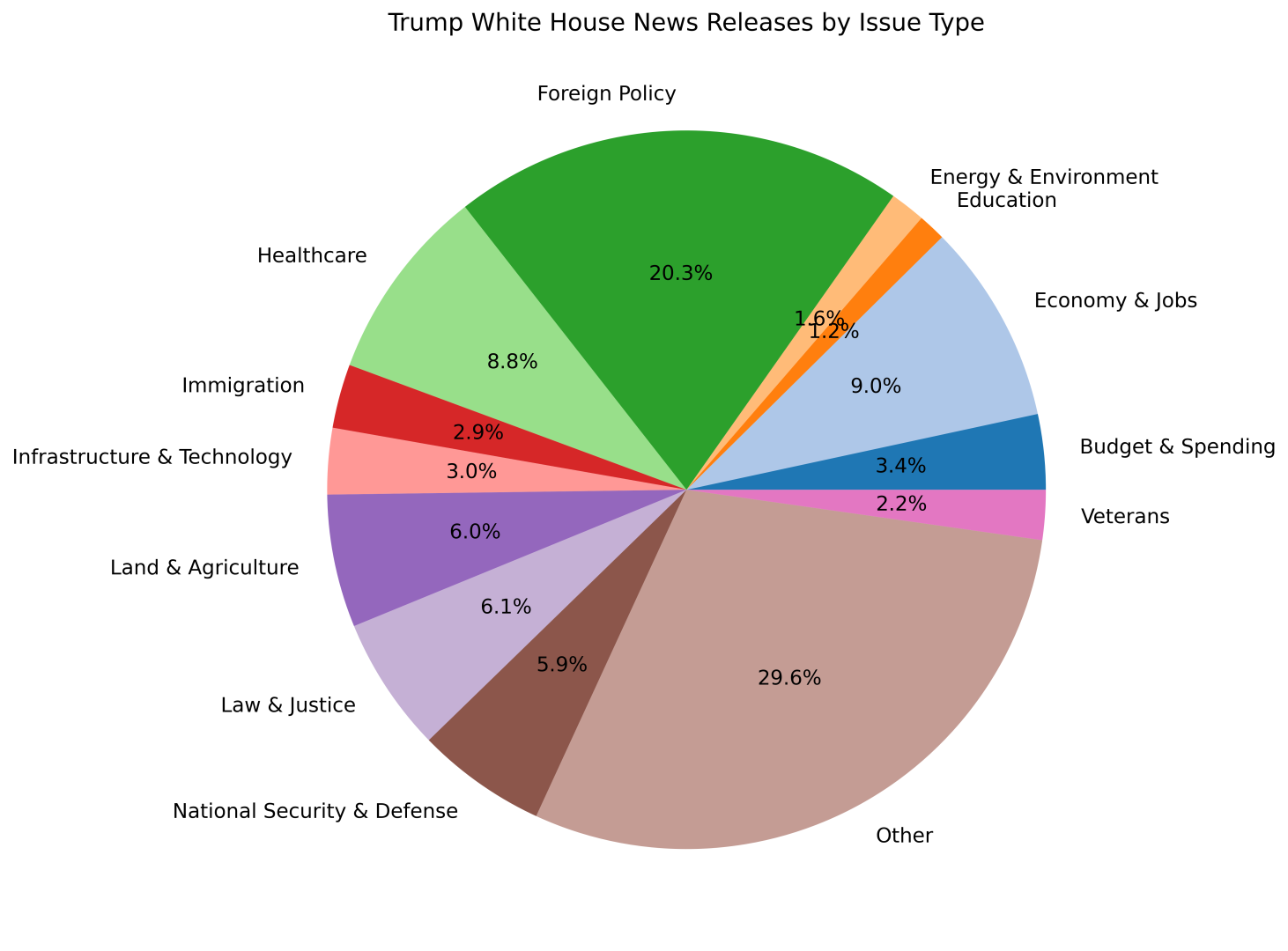
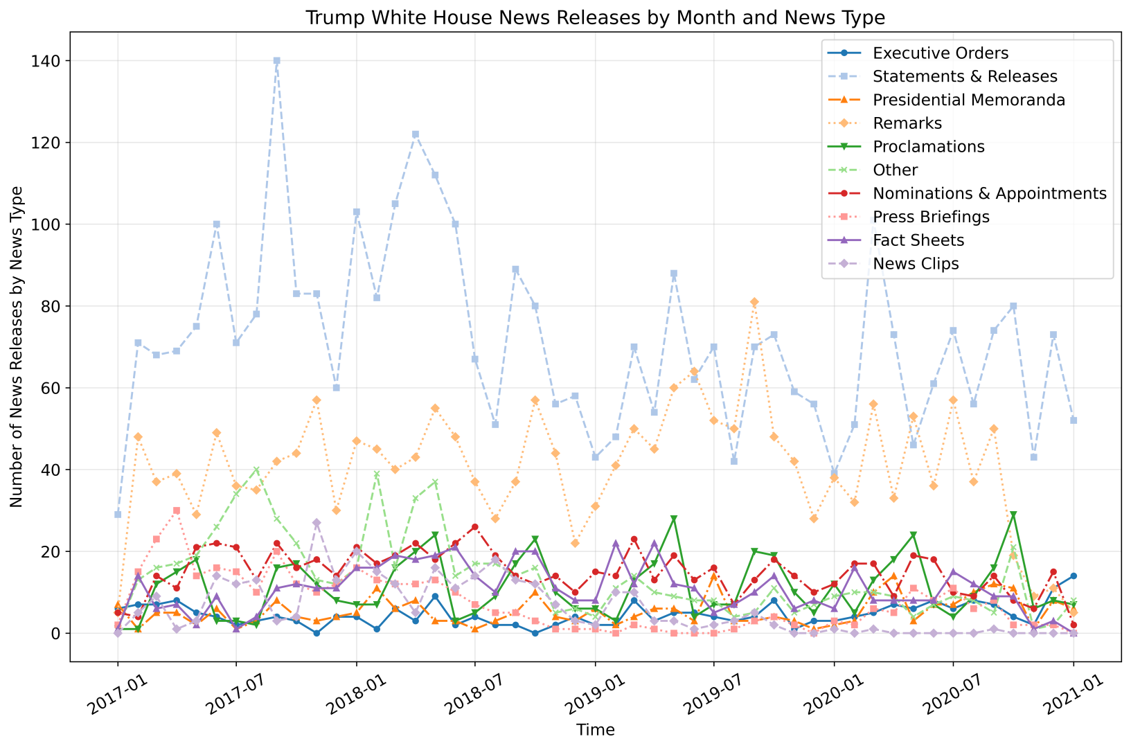
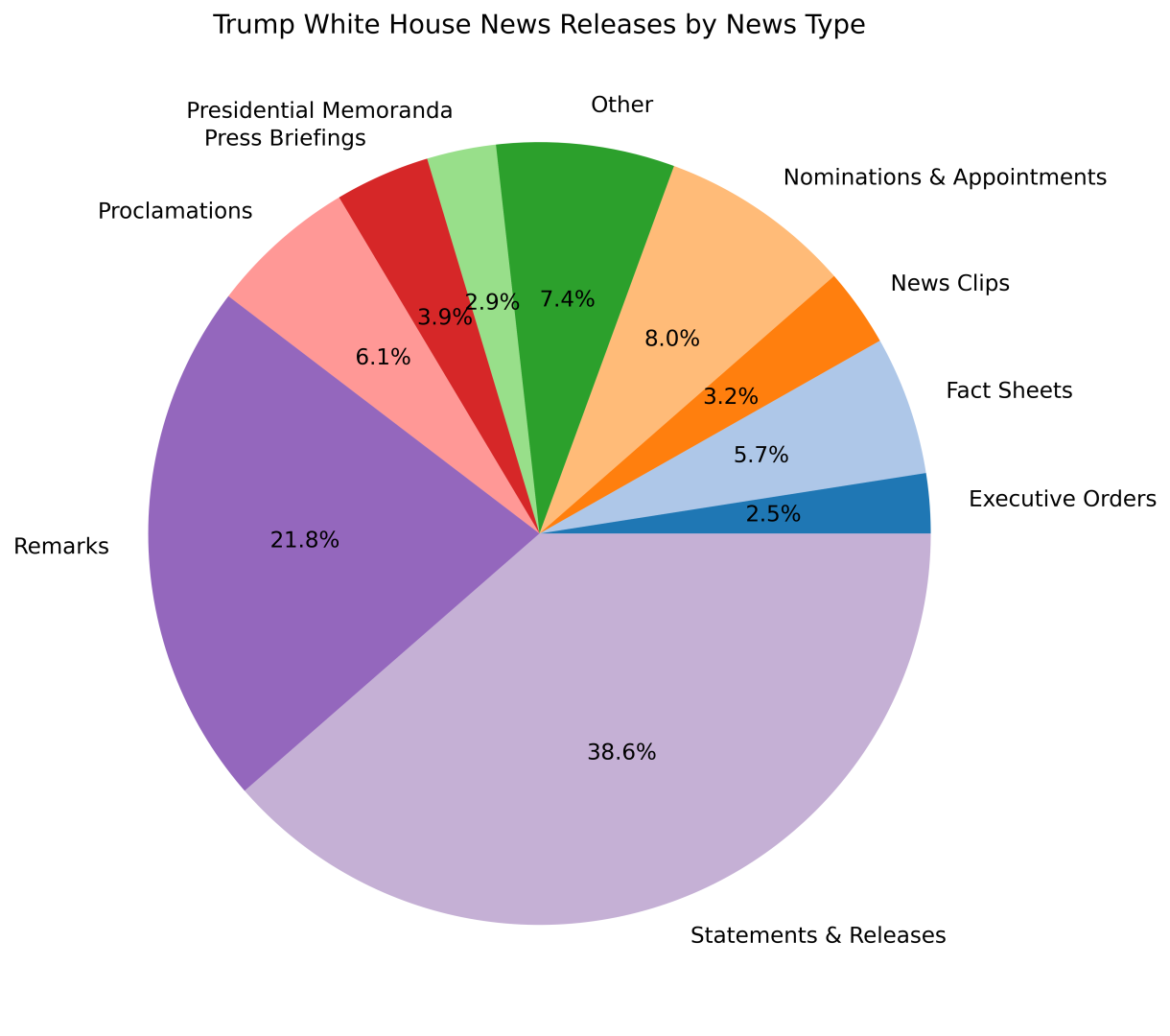
Below are data visualizations produced as part of the analysis.
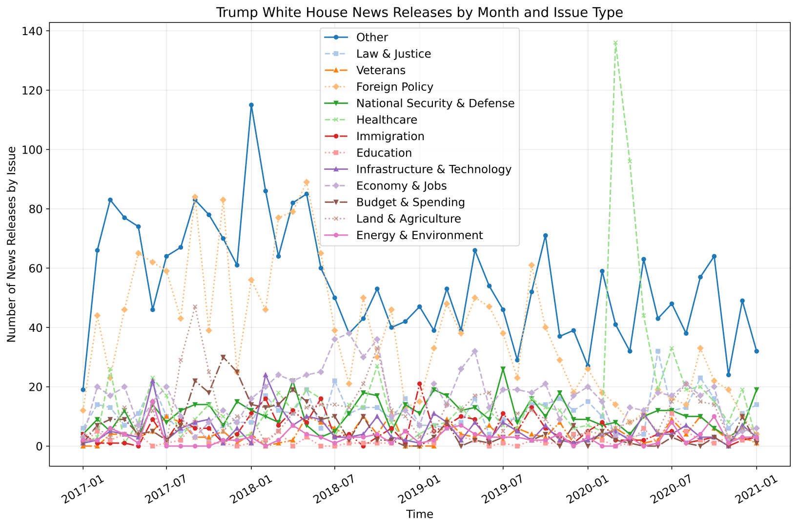
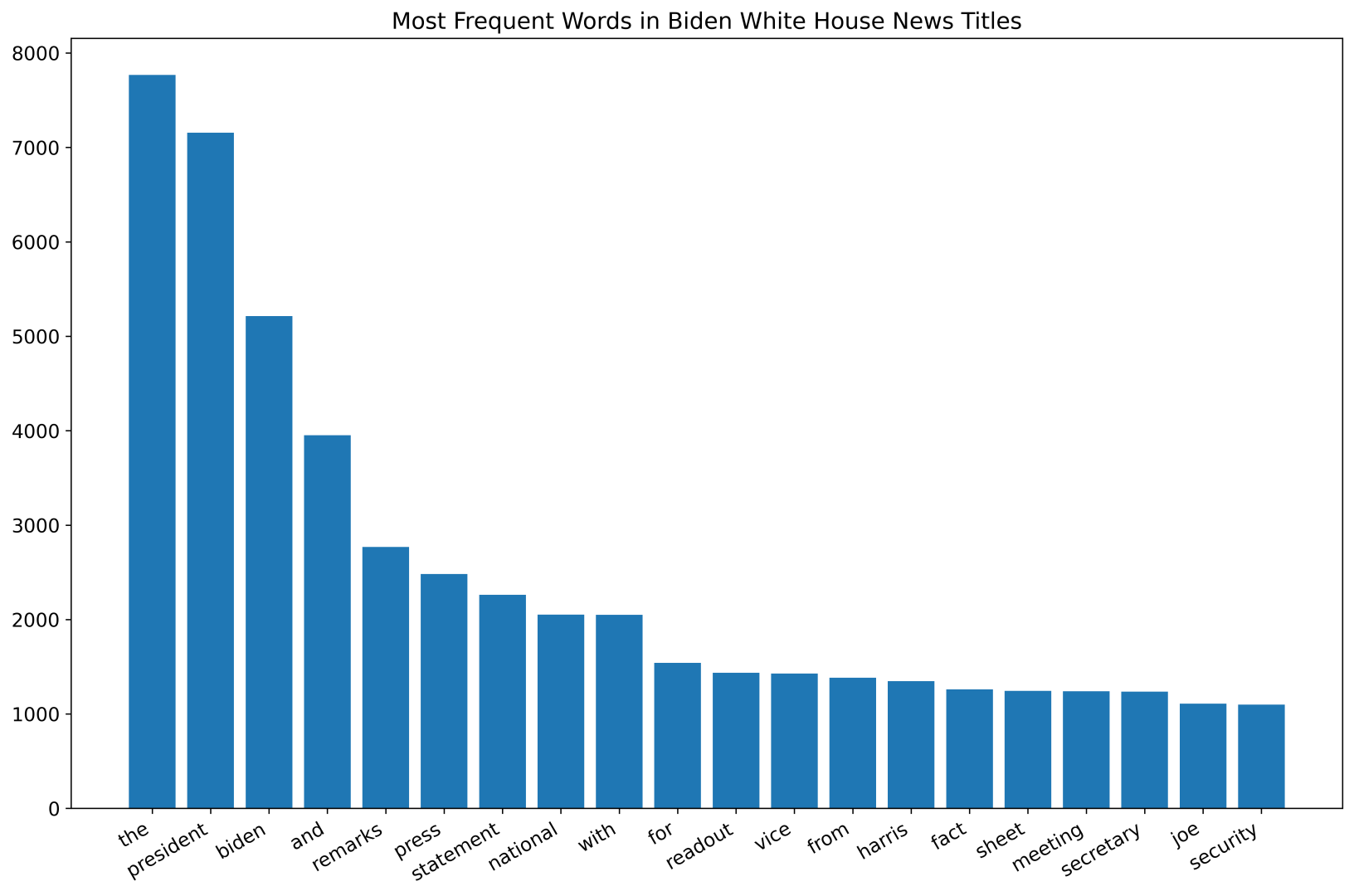
The creation of the first chart above, which shows the number of news pieces released by the Trump White House website each month grouped by the issue type it is tagged with, was one of the first eureka moments I had in my data science learning journey. I worked on this project during the COVID-19 pandemic. That particular data visualization confirms what one might reasonably hypothesize: a drastic increase in the number of healthcare-related news releases in March 2020. That chart was special, as it showed me that hidden beneath the thousands of news articles are tangible insights that align with — and, in this case, confirm — the realities of the world.
Tech Stack
The code of the project is written in Python. Web scraping is done using Requests and Beautiful Soup. Data wrangling is done using pandas. Data visualizations are created using Matplotlib and the wordcloud library.
Learn More
I explain how the code for this project works in this YouTube playlist. Feel free to give it a watch!
The code for the project can be found here.